import seaborn as sns
import matplotlib.pyplot as plt18 Statistical Graphics With Seaborn
Seaborn is a powerful statistical visualization library built on top of the Python plotting framework Matplotlib. While Pandas has basic plotting capabilities, Seaborn provides a more sophisticated and intuitive interface specifically designed for statistical graphics.
Some key strengths of Seaborn include:
- Beautiful default styles and color palettes
- Built-in themes for professional-looking visualizations
- Simple APIs for complex statistical plots
- Automatic handling of categorical variables
- Native integration with Pandas DataFrames
- Support for visualizing uncertainty and statistical estimates
To use Seaborn, first install it using pip (it is preinstalled on Colab), then import it into your Python environment:
Matplotlib is a plotting framework on which many plotting libraries, including Seaborn, are based. For some operations on Seaborn graphs we will have to use facilities of the Matplotlib layer, so we import it too.
In this chapter we’ll use the same atheletes that that we used in the last chapter. You can download it from https://mlbook.jyotirmoy.net/static/data/athletes.csv and import it with a command similar to
import pandas as pd
df = pd.read_csv('../static/data/athletes.csv')
Adjust the path in the read_csv call to the path where you saved the file.
Seaborn provides most of the standard statistical plot types.
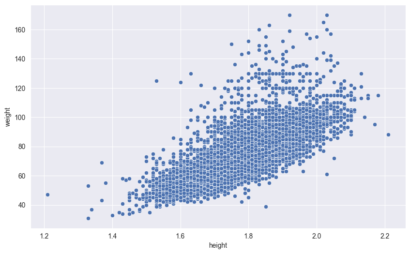
18.1 Scatter Plots
# Height vs weight
sns.scatterplot(df,
    x='height',
    y='weight',
)
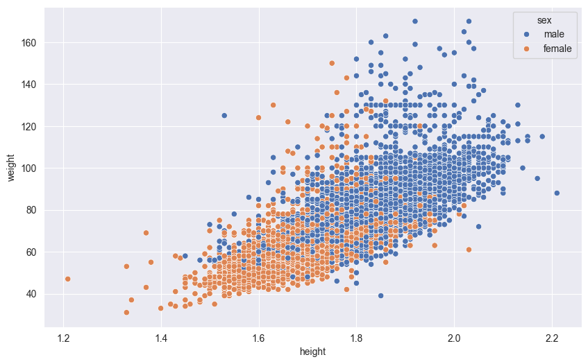
Seaborn allows you to encode additional dimensions of data by mapping point attributes to variables:
hue: Maps colors to categorical variables (like gender or sport type)size: Varies point sizes based on a numeric variable (like age or score)style: Changes point shapes based on categories (like different markers for different teams)alpha: Controls point transparency, useful for dense overlapping data
These visual encodings help reveal patterns and relationships across multiple variables simultaneously. Here’s an example using color (hue) to distinguish between sexes:
sns.scatterplot(df,
    x='height',
    y='weight',
    hue='sex'
)
18.2 Point plots
Point plots are excellent for comparing means across categories while showing uncertainty. When dealing with categorical variables, placing them on the y-axis offers several advantages:
- Long category names are easier to read horizontally
- More categories can fit on the plot without overlapping
- The natural left-to-right reading order helps compare values
In this example, we’ll show the mean weight of men and women by sport, with 95% confidence interval error bars. The error bars help us understand the statistical significance of differences between groups:
sns.pointplot(df,
    y = 'sport',
    x = 'weight',
    hue = 'sex',
    linestyles='')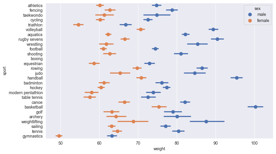
The linestyles='' suppress lines joining the lines joining the points for different sports which Seaborn draws by default.
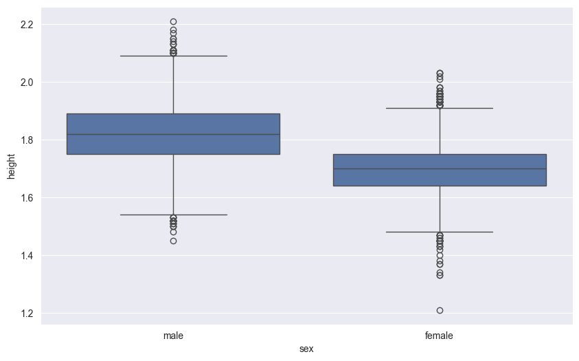
18.3 Box Plots
Box plots (also called box-and-whisker plots) provide a standardized way to display the distribution of data based on a five-number summary:
- The box shows the quartiles:
- Bottom edge: First quartile (25th percentile)
- Middle line: Median (50th percentile)
- Top edge: Third quartile (75th percentile)
- The whiskers extend to show the rest of the distribution:
- Upper whisker: Reaches to the largest value within 1.5 times the IQR
- Lower whisker: Reaches to the smallest value within 1.5 times the IQR
- Points beyond the whiskers are considered outliers and plotted individually
Box plots are particularly useful for:
- Comparing distributions between groups
- Identifying skewness and outliers
- Showing the spread and central tendency of data
Here’s a box plot comparing height distributions between sexes:
# GDP distribution by region
sns.boxplot(df,
    x='sex',
    y='height'
)
18.4 Histograms
Histograms are essential tools for visualizing the distribution of continuous data. They work by dividing the data range into intervals (bins) and counting how many data points fall into each bin.
Choosing the right number of bins is crucial:
- Too few bins (under-binning) can hide important patterns and details
- Too many bins (over-binning) can create noise and make the distribution appear jagged
- A common starting point is the square root of the number of data points
- You can also try different bin counts to find the best balance for your data
Let’s create a histogram showing the distribution of gold medals across countries. This will help us understand if medal counts are evenly distributed or if some countries dominate the medal table.
First, we need to aggregate the data to count gold medals by nationality:
gold_by_nat = df.groupby('nationality')['gold'].sum()
#Turn this into data frame by turnining
# nationality from an index to a column
gold_by_nat = gold_by_nat.reset_index()
print(gold_by_nat)
nationality gold
0 AFG 0
1 ALB 0
2 ALG 0
3 AND 0
4 ANG 0
.. ... ...
202 VIE 1
203 VIN 0
204 YEM 0
205 ZAM 0
206 ZIM 0
[207 rows x 2 columns]Now we plot the histogram.
sns.histplot(gold_by_nat,
    x = 'gold',
    bins = 10)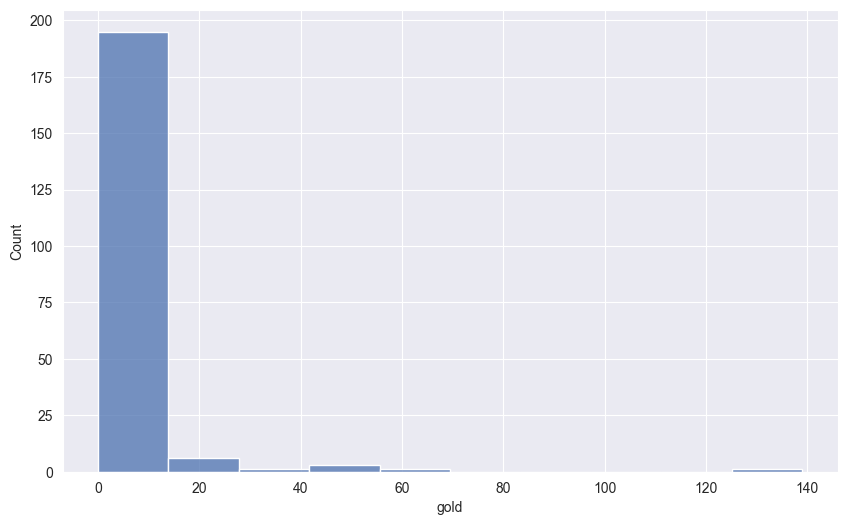
18.5 Kernel density plots
Kernel Density Estimation (KDE) creates a smooth, continuous estimate of a data’s probability distribution. Unlike histograms that count data points in discrete bins, KDE uses a more sophisticated approach based on kernel functions.
The process works by placing a kernel function (typically a Gaussian/normal distribution) at each point on the \(x\)-axis. This kernel acts as a weighting function that determines how much influence each data point has on the height of the density curve at that point on the \(x\)-axis. Points closer to the kernel’s center contribute more, while points further away receive lower weights. In this way, the kernel density estimate acts like a smoothed version of the histogram. While in a histogram each data point contributes to a single bin, here each data point contributes to the density plot everywhere, with the amount of contribution depending on how close the data point is to the point where the density is being calculated.
The bandwidth parameter (often denoted as ‘h’) controls how far each kernel spreads from its center point. This is analogous to bin width in histograms:
- A larger bandwidth creates more smoothing by spreading each kernel’s influence further
- A smaller bandwidth creates less smoothing, potentially revealing more local structure
- Too large a bandwidth can over-smooth and hide important features
- Too small a bandwidth can create artificial peaks from random noise
The final density estimate is created by summing up all these individual kernel functions and normalizing. This results in a continuous curve that estimates the probability density at any point in the data range.
Seaborn automatically selects a reasonable bandwidth using Scott’s rule, but you can adjust it using the bw_adjust parameter to fine-tune the level of smoothing:
18.5.1 One-dimensional KDE
Let’s visualize the height distribution using KDE:
sns.kdeplot(df,
    x='height',
    hue='sex',
    fill=True,
    alpha=.5)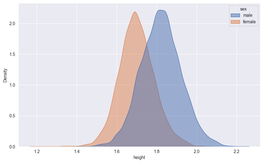
18.5.2 Two-dimensional KDE
We can also create 2D density plots to show the relationship between two continuous variables. The intensity of color indicates the density of points in that region:
sns.kdeplot(df,
    x='height',
    y='weight',
    fill=True,
    cmap='viridis')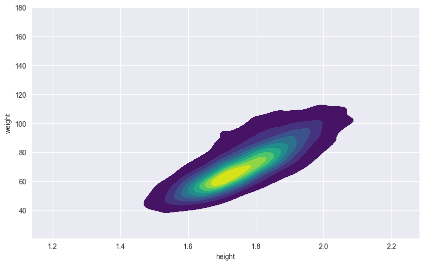
KDE plots are particularly useful for:
- Visualizing smooth distributions without binning artifacts
- Comparing multiple distributions
- Identifying modes and patterns in continuous data
- Understanding joint distributions of two variables
18.6 Faceted Plots
Faceted plots (also called small multiples or trellis plots) split your data into subsets and create separate panels for each subset. This technique helps reduce visual complexity by breaking down a complex visualization into smaller, more manageable chunks while maintaining the same scales and styling across all panels.
Faceting proves invaluable in several common data visualization scenarios. When comparing patterns across different categories, faceted plots allow viewers to focus on one subset at a time while maintaining the ability to make quick comparisons between panels. This is especially helpful when dealing with overcrowded plots where multiple categories or variables would otherwise create visual clutter and confusion.
Furthermore, faceting excels at revealing interactions between variables that might be obscured in a single combined plot. By separating the data into distinct panels while maintaining consistent scales across all plots, viewers can easily identify patterns, trends, and relationships that might otherwise be missed. This consistency in scaling is crucial for making valid comparisons between different subsets of your data.
Here’s an example showing height vs weight relationships, with separate panels for each sex:
# Create a FacetGrid
g = sns.FacetGrid(df, col="sex", height=6)
# Map a scatter plot onto the grid
g.map_dataframe(sns.scatterplot, x="height", y="weight")
# Add titles
g.fig.suptitle('Height vs Weight by Sex', y=1.05)
g.set_axis_labels("Height (cm)", "Weight (kg)")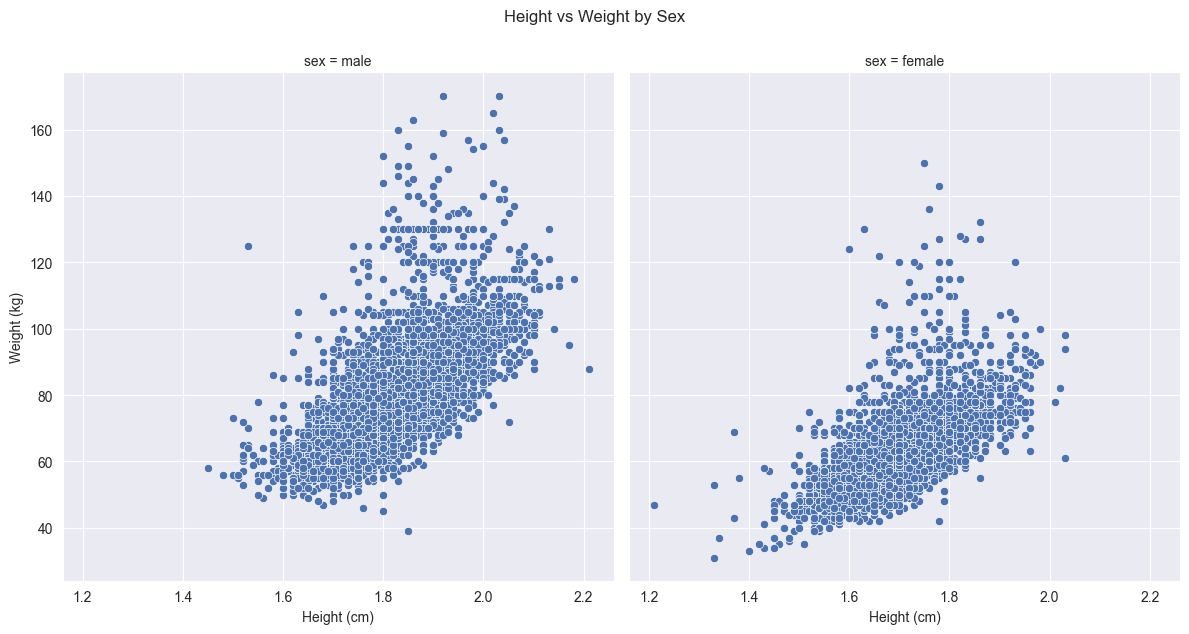
Let’s break down the FacetGrid syntax:
FacetGrid(df, col="sex", height=6): Creates a grid of plotsdf: The input DataFramecol: Variable used to split data into columnsheight: Height of each subplot in inches
map_dataframe(): Applies a plotting function to each subset of data- Takes a Seaborn plotting function and its parameters
- Automatically handles data splitting and axis creation
Here are more examples of FacetGrid usage (not executed):
# Create a grid with both rows and columns
g = sns.FacetGrid(df,
    col="sport",    # Split by sport in columns
    row="sex",      # Split by sex in rows
    height=3,       # Height per subplot
    aspect=1.5)     # Width/height ratio
g.map_dataframe(sns.scatterplot, x="height", y="weight")

# Create a wrapped grid with multiple columns
g = sns.FacetGrid(df,
    col="sport",    # Split by sport
    col_wrap=3,     # Wrap after 3 columns
    height=4)       # Height per subplot
g.map_dataframe(sns.histplot, x="height")
Comparing this faceted approach to our earlier scatter plot that used colors to distinguish between sexes reveals several advantages. While color coding can effectively show group differences in a single plot, faceting provides clearer separation that makes it easier to identify patterns within each group without any visual interference from the other group.
The faceted approach also ensures that both plots share exactly the same axis scales and ranges, something that would be harder to guarantee if we created separate plots manually. This consistent scaling is crucial for making valid comparisons between groups - any differences in the pattern of points between panels represent real differences in the data, not artifacts of different scales.
Furthermore, faceting eliminates the potential issue of overplotting that can occur when points from different groups overlap in a single plot. Each group now has its own dedicated space, making it easier to see the full distribution of points and identify any outliers or unusual patterns.
18.7 Other plot types
Seaborn offers many other specialized plot types for statistical visualization. These include violin plots for showing distribution shapes, swarm plots for displaying all points without overlap, regression plots with built-in confidence intervals, categorical plots like strip plots and bar plots, and joint plots that combine different visualization types. For a complete overview, consult the Seaborn documentation.
18.8 Customizing plots
18.8.1 Themes
Seaborn themes control the overall visual appearance of plots, including background grids, colors, and other styling elements. Themes help create consistent, publication-quality visualizations. You can set themes using sns.set_style() and change color palettes using sns.set_palette().
Available style themes include:
darkgrid(default): Dark lines with gridwhitegrid: White background with griddark: Dark background without gridwhite: White background without gridticks: Minimal with axis ticks
Color palettes include:
deep(default): Deep, saturated colorspastel: Soft pastel colorsmuted: Muted, less saturated colorsbright: Bright, vibrant colorsdark: Darker versions of colorscolorblind: Colorblind-friendly palette
Here’s our earlier point plot with a different style and palette:
# Set the style and palette
sns.set_style("whitegrid")
sns.set_palette("pastel")

# Create the plot
sns.pointplot(df,
    y = 'sport',
    x = 'weight',
    hue = 'sex',
    linestyles='')

# Reset to default style for other plots
sns.set_style("darkgrid")
sns.set_palette("deep")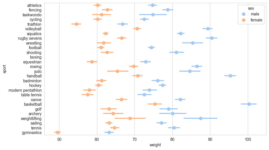
You can also create custom palettes using sns.color_palette() with specific color codes or by selecting from various color spaces like husl or hls.
18.8.2 Titles
Seaborn plots are built on Matplotlib, so we can use Matplotlib’s functions to customize titles. There are several ways to add titles:
# Create the scatter plot
sns.scatterplot(df,
    x='height',
    y='weight',
    hue='sex'
)

# Add main title and axis labels
plt.title('Height vs Weight by Sex')
plt.xlabel('Height (cm)')
plt.ylabel('Weight (kg)')

# Display the plot
plt.show()
You can also use more specific Matplotlib methods for fine-grained control: - plt.suptitle() for figure-level titles - ax.set_title() when working with specific axes objects - ax.set(title='...', xlabel='...', ylabel='...') for setting multiple properties at once
18.8.3 Figure size
You can control the size of Seaborn plots in several ways. The most common method is using Matplotlib’s plt.figure() before creating the plot:
# Set figure size to 10 inches wide by 6 inches tall
plt.figure(figsize=(10, 6))

sns.scatterplot(df,
    x='height',
    y='weight',
    hue='sex'
)

plt.title('Height vs Weight by Sex')
plt.show()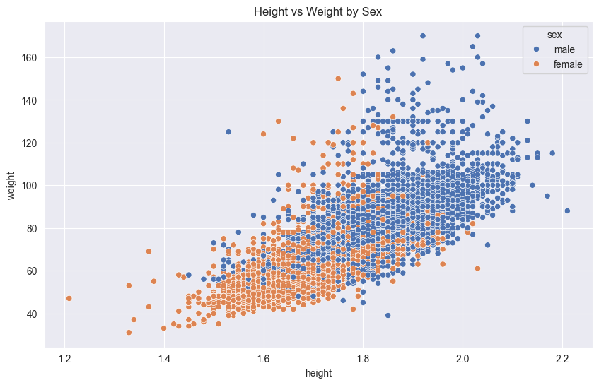
You can also set the default figure size for all plots in a session:
# Set default figure size
plt.rcParams['figure.figsize'] = [10, 6]

# Future plots will use this size unless explicitly changed
The figsize parameter takes a tuple of (width, height) in inches. For publication-quality figures:
- Standard single-column figures: 6-8 inches wide
- Double-column figures: 10-12 inches wide
- Adjust height to maintain a pleasing aspect ratio
18.9 Saving plots
When saving plots, it’s important to understand the fundamental difference between raster and vector graphics:
Raster graphics store images as a grid of individual pixels, each with its own color value. When you zoom in on a raster image, you’ll eventually see these individual pixels, making the image appear blocky. The quality of a raster image depends on its resolution (pixels per inch or DPI).
Vector graphics, on the other hand, store images as mathematical formulas describing shapes, lines, and colors. This means vector images can be scaled to any size without losing quality - they’ll always look sharp at any resolution. They’re also typically smaller in file size for simple plots.
Matplotlib (and therefore Seaborn) supports saving plots in both raster and vector formats:
18.9.1 Raster Formats
Raster formats store images as a grid of pixels:
- PNG (.png): Best for web and presentations, supports transparency
- JPEG (.jpg): Good for photographs, smaller file size but no transparency
- TIFF (.tiff): Common in publishing, supports high resolution
18.9.2 Vector Formats
Vector formats store images as mathematical descriptions:
- PDF (.pdf): Ideal for publications, maintains quality at any size
- SVG (.svg): Perfect for web, scalable and editable
- EPS (.eps): Traditional format for scientific publishing
Here’s how to save a plot in different formats:
# Create your plot
sns.scatterplot(df,
    x='height',
    y='weight',
    hue='sex'
)

# Save in different formats
plt.savefig('plot.png', dpi=300)  # High-res PNG
plt.savefig('plot.pdf')           # Vector PDF
plt.savefig('plot.svg')           # Vector SVG

# Clear the plot
plt.clf()
Key considerations:
- Use
dpiparameter for raster formats to control resolution - Set
bbox_inches='tight'to prevent clipping - Call
plt.clf()after saving to free memory - Vector formats are best for publication-quality figures